Dining Room Curtain Colors That Set the Mood
Dining room curtain colors do more than dress a window — they shape the entire atmosphere of every meal, from quiet weekday breakfasts to candlelit dinner parties. The right shade can make a room feel intimate and cozy, or bright and effortlessly casual, often more than any other single design choice in the space.
This guide breaks down the color directions that work best for dining rooms, based on the mood you’re going for and how the room actually gets used.
Why Color Matters More in the Dining Room
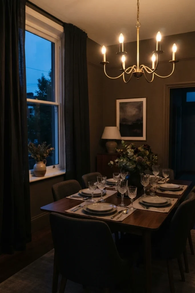
Unlike a bedroom or living room used throughout the day, a dining room’s lighting and mood shift dramatically between daytime meals and evening entertaining, which makes curtain color a bigger decision here than almost anywhere else in the home.
What dining room curtain color actually affects:
- How intimate or open the room feels during dinner parties
- Whether the space reads as casual or formal
- How table settings, linens, and dishware are visually framed
- The room’s perceived size and ceiling height
- How well the space transitions from bright lunches to moody dinners
Getting this right means the room works for both a quick weekday breakfast and a full holiday dinner.
Neutral Tones for Timeless Elegance
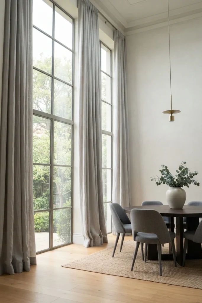
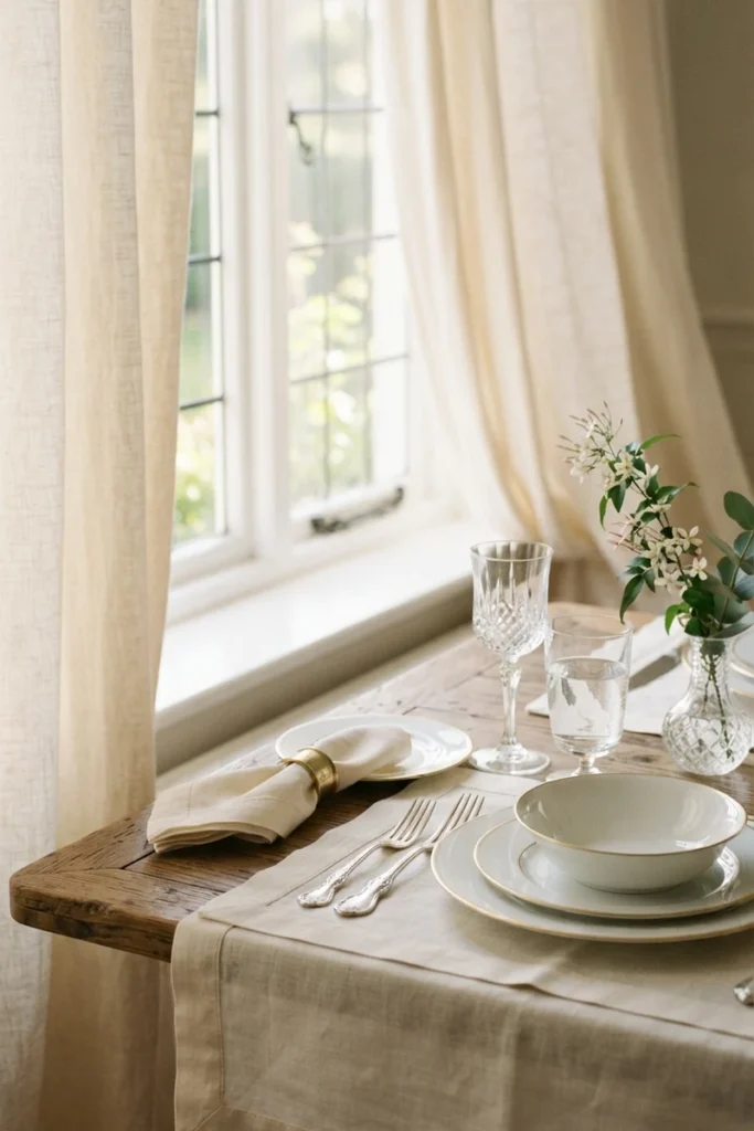
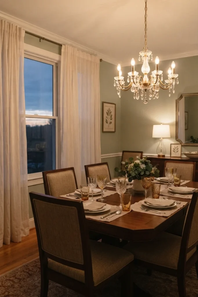
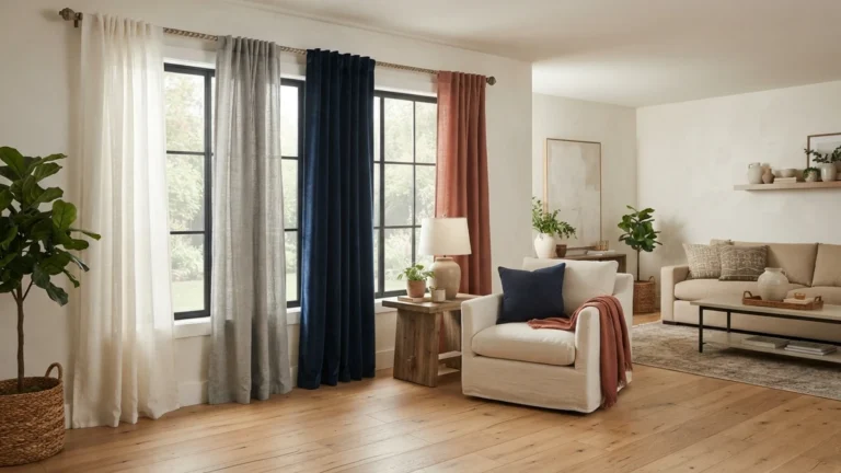
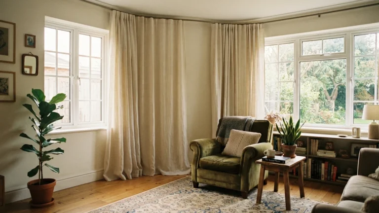
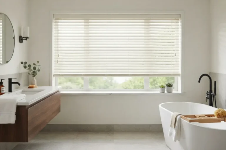
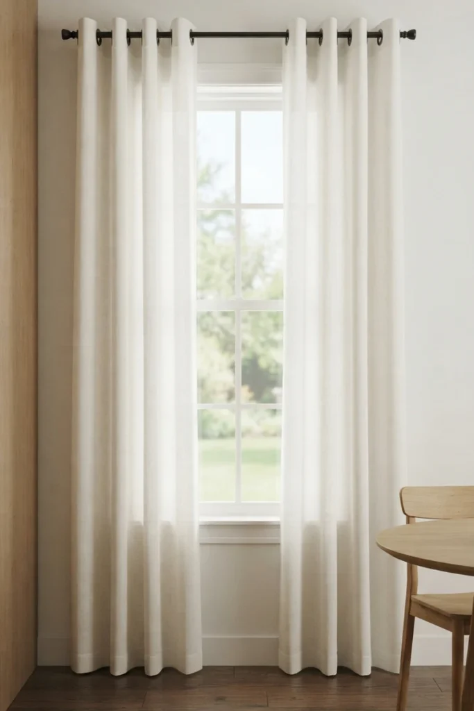
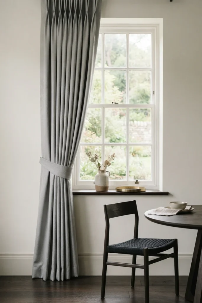
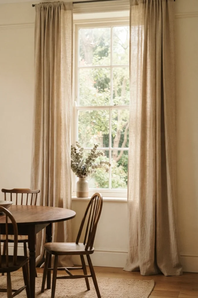
Beige, soft gray, and warm white remain the safest, most versatile dining room curtain colors, working with classic, modern, or transitional interior styles without ever looking out of place.
Why neutral dining room curtains work so well:
- Pair easily with changing table settings and seasonal decor
- Create a simple, sophisticated backdrop that never feels dated
- Reflect light well, keeping the room bright during the day
- Work in both small and large dining spaces
- Provide a flexible base for bold table centerpieces
Neutral curtains are the easiest starting point if you’re not ready to commit to a bolder direction.
Bold, Dramatic Colors for Intimate Dinners
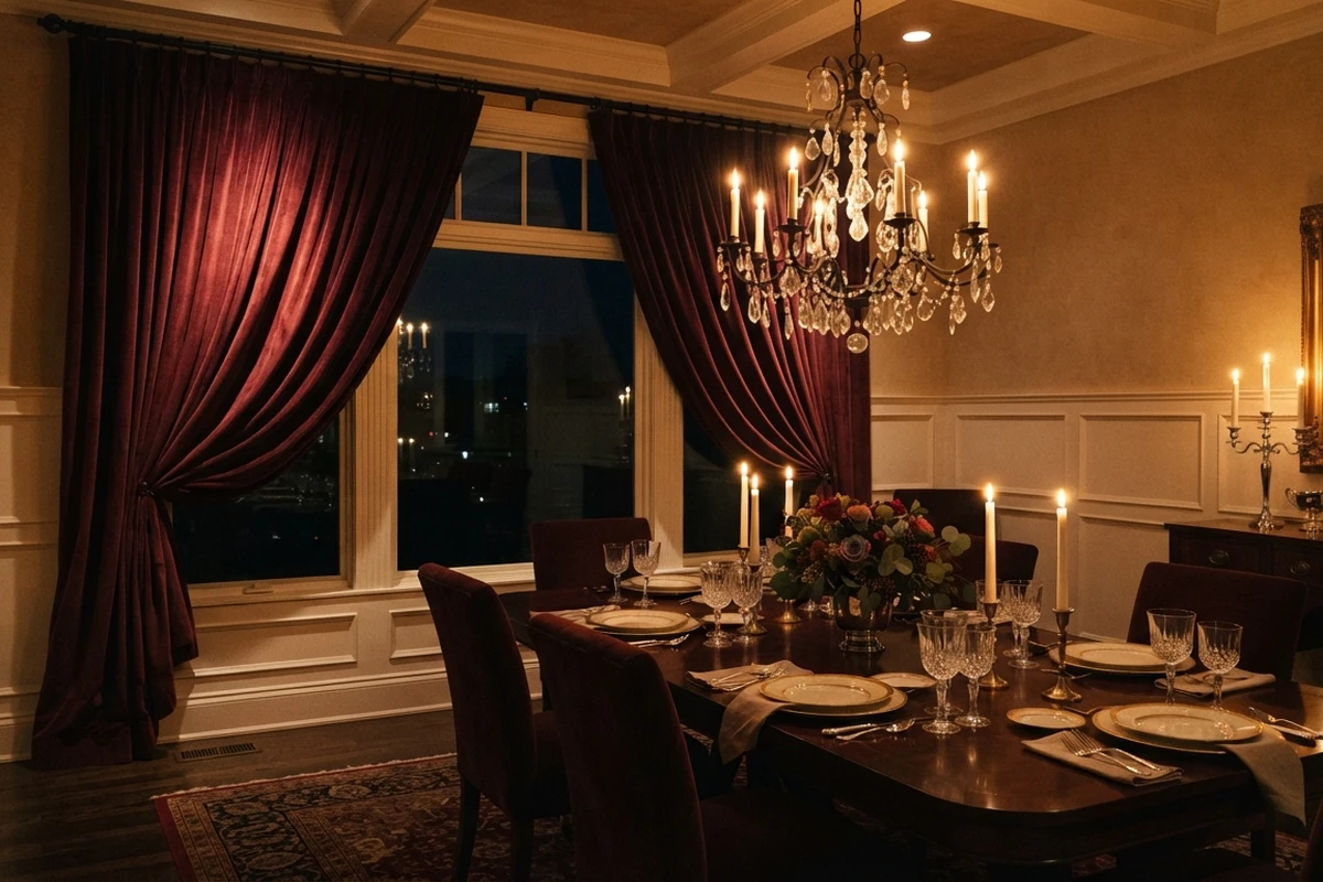
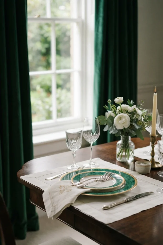
Burgundy, deep plum, forest green, and navy create an intimate, cocooning feeling that’s especially effective for evening dining and dinner parties, making a room feel smaller and cozier in the best possible way.
Why bold dining room colors work for entertaining:
- Make guests feel embraced by the space during dinners
- Pair beautifully with candlelight and warm lighting
- Add drama and personality without needing bold patterns
- Work especially well in rooms with limited natural light
- Create a strong visual anchor against neutral walls and furniture
These deeper tones tend to look their best once the sun goes down and the table is set.
Soft Pastels for an Airy, Casual Feel
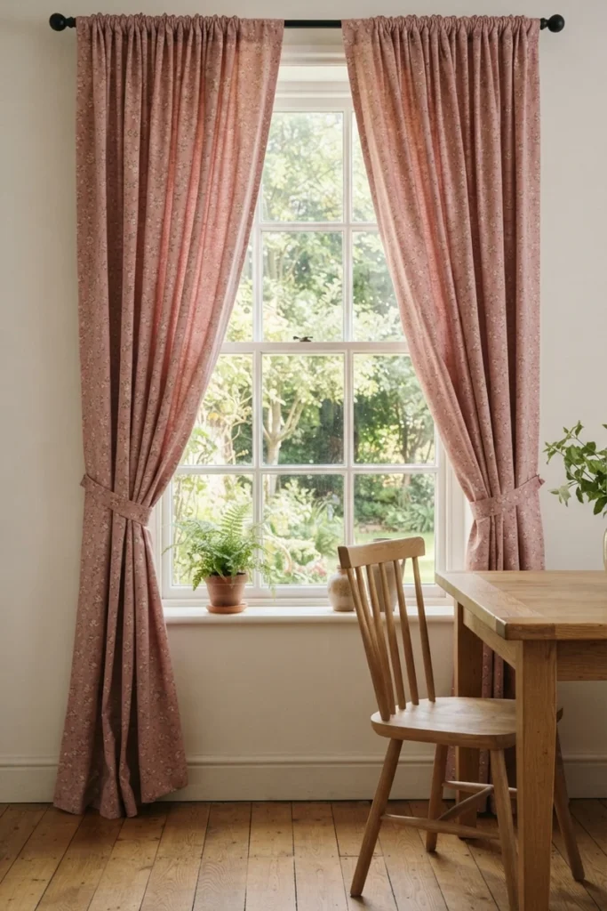
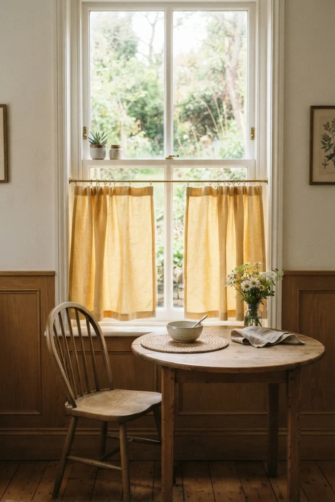
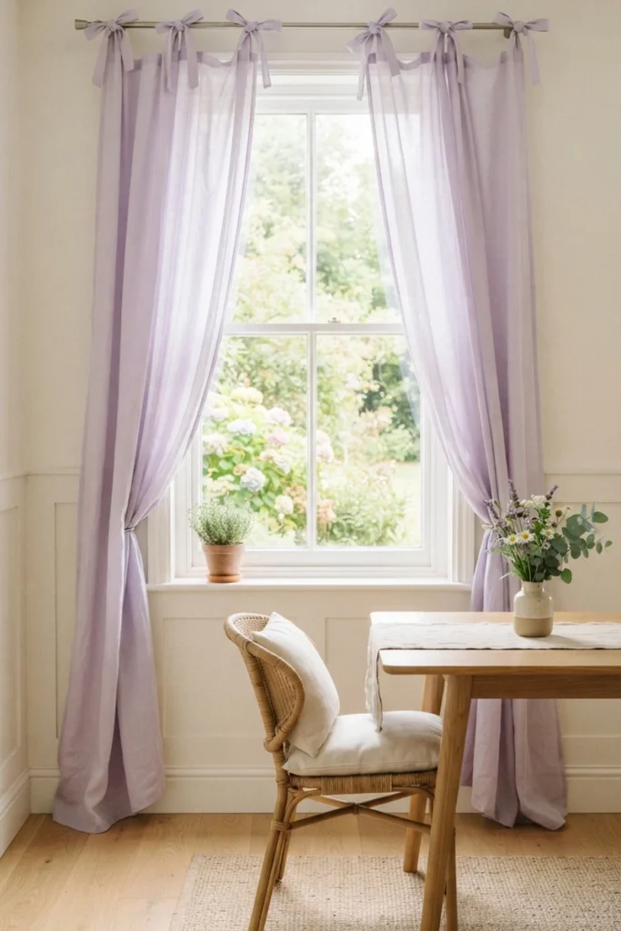
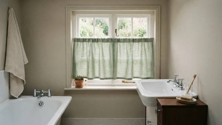
Light lavender, buttery yellow, and soft sage bring a gentle, airy warmth to a dining room, especially one used often for casual daytime meals rather than formal evening entertaining.
Why pastel dining room curtains work well:
- Add color without overwhelming a smaller dining space
- Suit farmhouse, cottage, and contemporary interiors alike
- Keep the room feeling bright and welcoming during the day
- Pair naturally with light wood furniture and natural textures
- Offer a gentler alternative to fully neutral or fully bold choices
Pastels are a strong middle ground for anyone unsure between neutral and dramatic.
Layering Colors with Sheers and Drapes
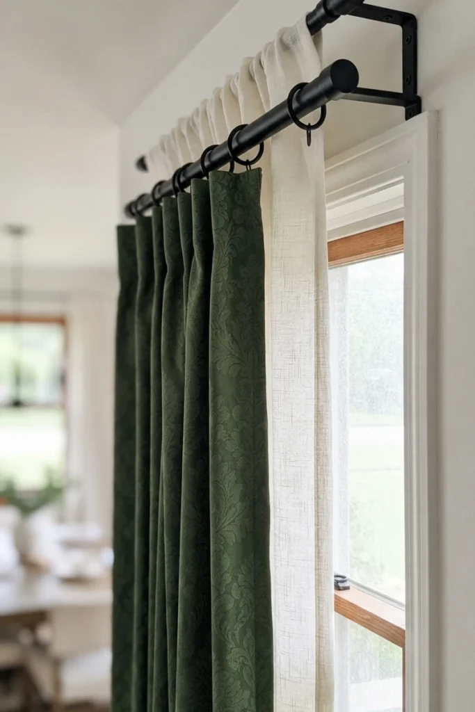
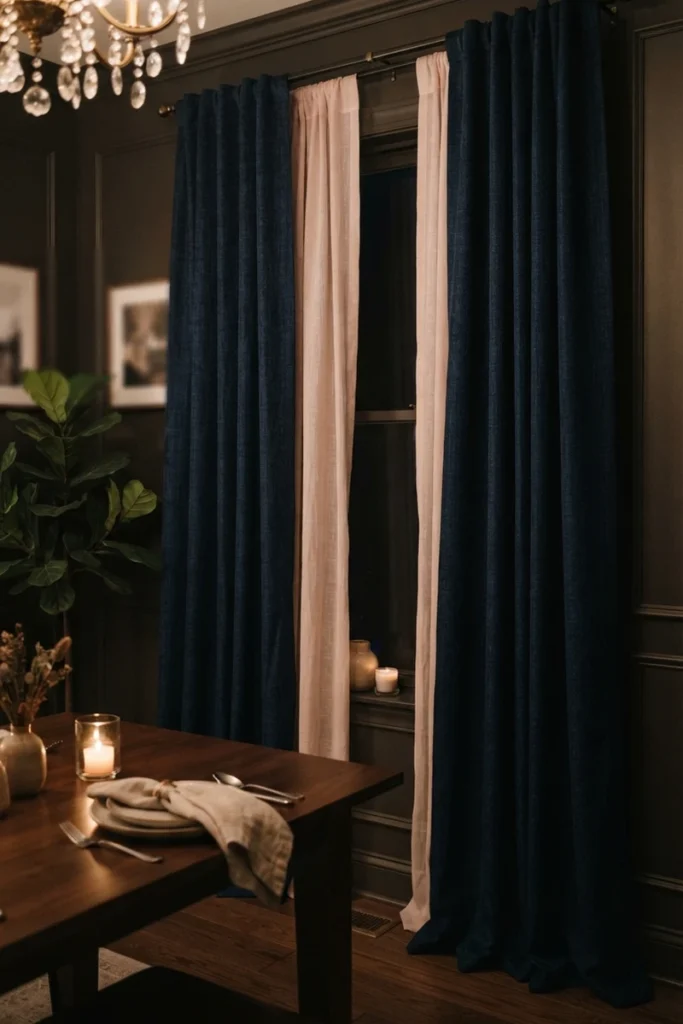
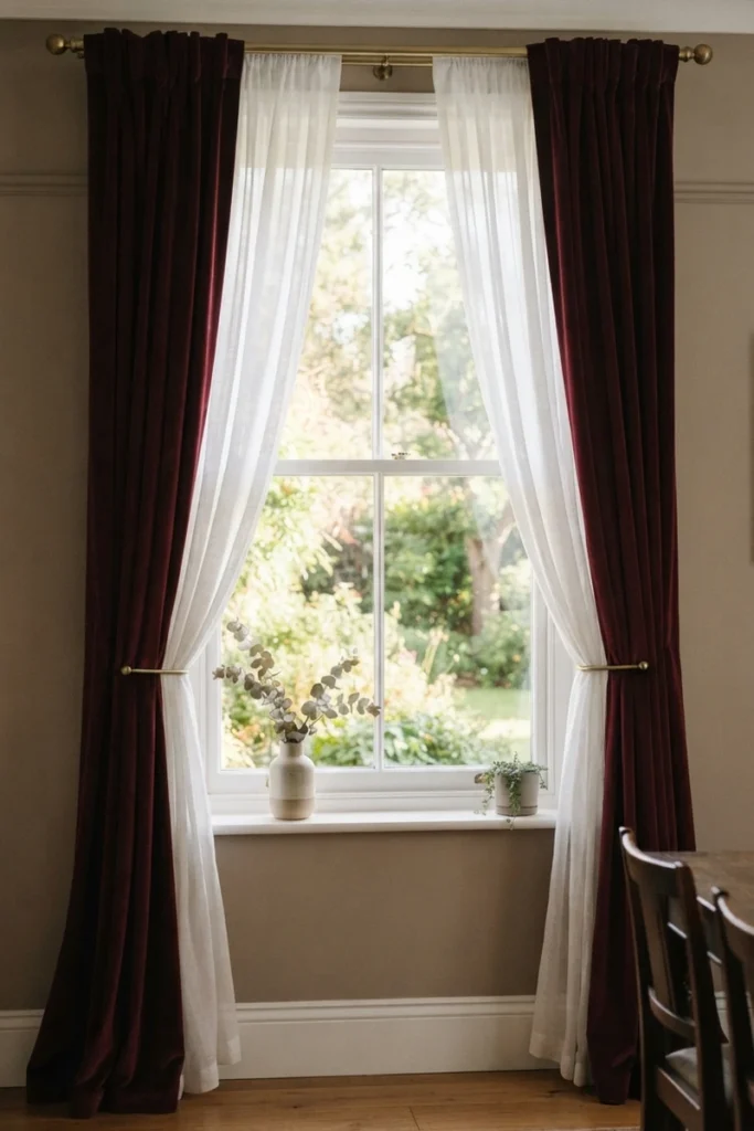
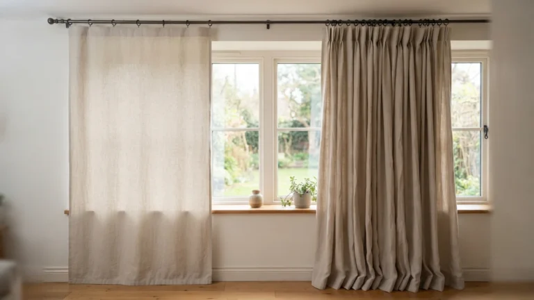
Pairing a soft, light-colored sheer with a richer, heavier drape on the same rod gives a dining room the flexibility to shift moods throughout the day without changing anything physically.
How color layering works in a dining room:
- Sheers in soft white or pale tones handle daytime brightness
- Heavier drapes in jewel tones add drama for evening use
- Both layers can be adjusted independently as needed
- Creates visual depth that a single curtain layer can’t match
- Allows one dining room to serve two very different moods
This approach solves the tension between wanting both an airy daytime space and a moody evening one.
Common Mistakes to Avoid
- Choosing a curtain color that competes with your table linens
- Picking a bold, dark color in a dining room with limited natural light and no candlelit use
- Ignoring how the color will look under both daylight and evening lighting
- Matching curtains too literally to wall color, making the room feel flat
- Overlooking how curtain color interacts with a chandelier or lighting fixture’s tone
A quick color test at both times of day prevents most of these mistakes before you commit.
FAQ
What color curtains work best in a small dining room?
Light neutrals or soft pastels tend to work best, since they help a smaller room feel more open rather than closing it in the way a dark, dramatic color can.
Should dining room curtains match the wall color?
They don’t need to match exactly — a close coordinating tone or a deliberate contrast both work, as long as the color feels like an intentional choice relative to the room’s furniture and lighting.
Can I use bold curtain colors in a dining room I use every day?
Yes, though bold colors tend to suit rooms used more for evening entertaining — a daily-use dining space often benefits from a lighter, more neutral base color instead.
External Resources
For more dining room styling inspiration:
Final Thoughts on Dining Room Curtain Colors
Once you’ve settled on a color direction, our dining room curtain ideas guide covers styles and fabrics worth pairing with it.
💡 Found this helpful? Save this guide on Pinterest so you can find it again when you’re ready to shop!