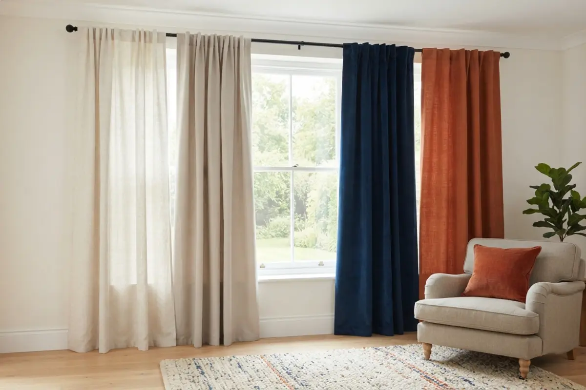
Curtain Color Guide: Choosing the Right Shade for Any Room
Color is one of the biggest decisions in choosing curtains — bigger, in many rooms, than fabric or length — because it interacts with everything else already in the space: walls, furniture, flooring, and light. This curtain color guide breaks down the most common color approaches, what each one does for a room, and how to pick a shade you won’t want to change again in a year.
Before You Start: 2 Questions to Ask Yourself
1. Do you want the curtains to blend in or stand out?
Curtains that match or closely coordinate with the wall color tend to disappear visually, making a room feel larger and calmer. Curtains in a contrasting or bold color become a focal point in their own right, adding personality and drawing the eye toward the window.
2. How much natural light does the room get?
Darker curtain colors can make an already dim room feel smaller and heavier, while lighter colors help bounce available light around. Rooms with abundant natural light have more flexibility to go darker or bolder without the space feeling closed in.
Neutral Curtains (White, Cream, Beige)
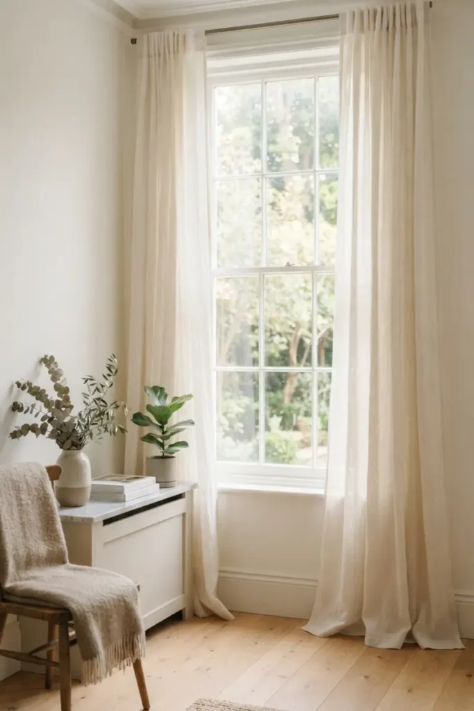
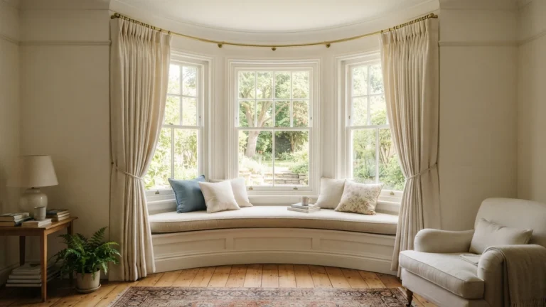
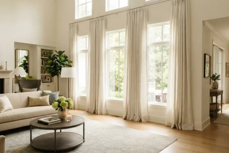
Neutral curtains are the safest and most versatile color choice available, working with virtually any wall color, furniture style, or décor scheme without ever looking out of place. They tend to make rooms feel brighter and larger, since light-colored fabric reflects rather than absorbs natural light, and they age well stylistically — a neutral curtain rarely looks dated the way a trendy color eventually can. The trade-off is that neutrals offer the least visual drama or personality, functioning more as a quiet background element than a design statement.
Best for: Any room where flexibility matters more than making a bold statement, especially spaces with limited natural light.
Curtains That Match the Wall Color
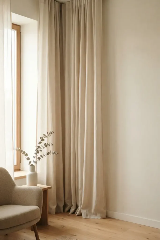
Choosing a curtain in the same or a very close shade to the wall color creates a seamless, cohesive look that makes the window feel like a natural extension of the wall rather than a separate element. This approach is particularly effective in smaller rooms, where minimizing visual breaks between surfaces helps the space feel larger and less cluttered. The downside is that this look can read as flat or under-designed if there’s nothing else in the room adding contrast or visual interest.
Best for: Small rooms or spaces where you want the walls and windows to feel like one continuous, uninterrupted surface.
Bold or Contrasting Curtains
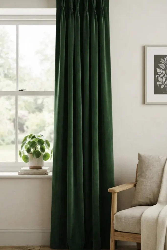
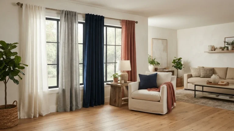
A curtain in a color that clearly contrasts with the walls — a deep navy against white walls, or a rich forest green against a neutral palette — turns the window into a genuine focal point rather than a background element. This works especially well in rooms with otherwise simple, neutral furniture and décor, since the curtain gets to do the visual heavy lifting without competing against other bold choices. The main risk is committing to a color that feels overwhelming or dated sooner than a neutral would, so it’s worth choosing a shade you’re confident you’ll still like in a few years.
Best for: Rooms with simple, neutral furniture that could use one strong, deliberate pop of color.
Curtains That Coordinate with Existing Décor
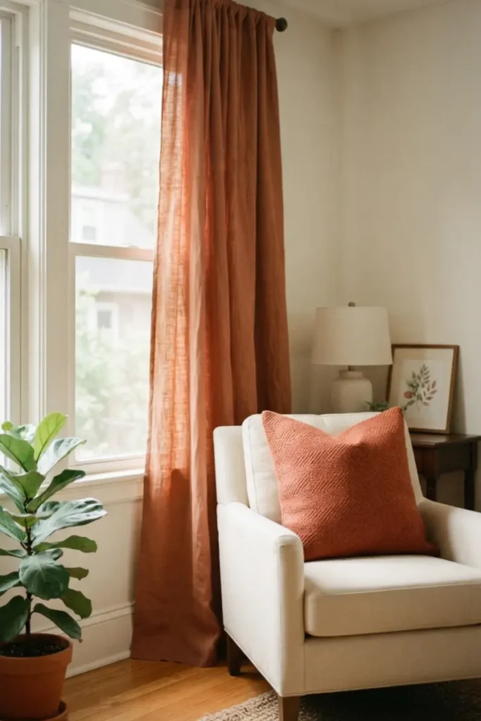
Rather than matching or contrasting with the walls, this approach pulls a color from something already in the room — a rug, an accent pillow, or a piece of art — and uses it in the curtains to tie the whole space together. This creates a sense that the room was designed as a whole rather than assembled piece by piece, since the same color shows up in more than one place. The main challenge is finding curtains in the exact right shade to coordinate convincingly, which sometimes takes more searching than choosing a straightforward neutral or contrasting color.
Best for: Rooms with an existing statement piece — a rug, artwork, or accent chair — that you want the whole space to feel connected to.
Curtain Color Guide: Choosing by Room Type
| Feature | Neutral | Matching Wall | Bold/Contrasting | Coordinating with Décor |
|---|---|---|---|---|
| Visual impact | Low | Very low | High | Moderate |
| Makes room feel larger? | Yes | Yes | No | Depends |
| Long-term flexibility | Excellent | Good | Lower | Good |
| Best rooms | Any, especially low-light | Small rooms | Simple, neutral rooms | Rooms with a statement piece |
How to Choose the Right Curtain Color for Your Room
Start with how much natural light the room gets and how large it feels — smaller or dimmer rooms generally benefit from neutral or wall-matching curtains that keep the space feeling open. From there, look at what’s already fixed in the room, like flooring and large furniture, and decide whether you want the curtains to blend into that palette or intentionally stand apart from it. If you already have a rug, artwork, or accent piece you love, pulling a color from it is often the easiest way to land on a shade that feels intentional rather than random. For more on color theory in interior design, see Interior design experts.
FAQ
Should curtains be lighter or darker than the walls?
There’s no universal rule — lighter curtains tend to make a room feel more open and airy, while darker curtains add coziness and drama. The right choice depends on the room’s size, light levels, and the mood you’re going for.
Do curtains need to match throughout the whole house?
No, curtains can vary from room to room based on each space’s function and light — a bold color in a dining room and neutral curtains in a bedroom can absolutely coexist in the same home.
What curtain color makes a small room look bigger?
Light neutral colors, especially shades close to the wall color, generally make a small room feel larger since they minimize visual breaks and reflect more light than darker fabrics.
Final Thoughts on Curtain Colors
Once you’ve settled on a color, the fabric it’s made from matters just as much for how that color actually looks in the room. Our guide to the best curtain fabrics breaks down cotton, linen, velvet, and polyester in more detail.